SCurve and Bar Charts
Project charts serve as a powerful tool for visualizing project progress, enabling a clear comparison between the planned baseline and actual performance in terms of work and cost.
QuickPlan offers two types of charts for this purpose: the S-Curve Chart and the Bar Chart. These charts provide a dynamic and intuitive way to monitor project health and make informed decisions.
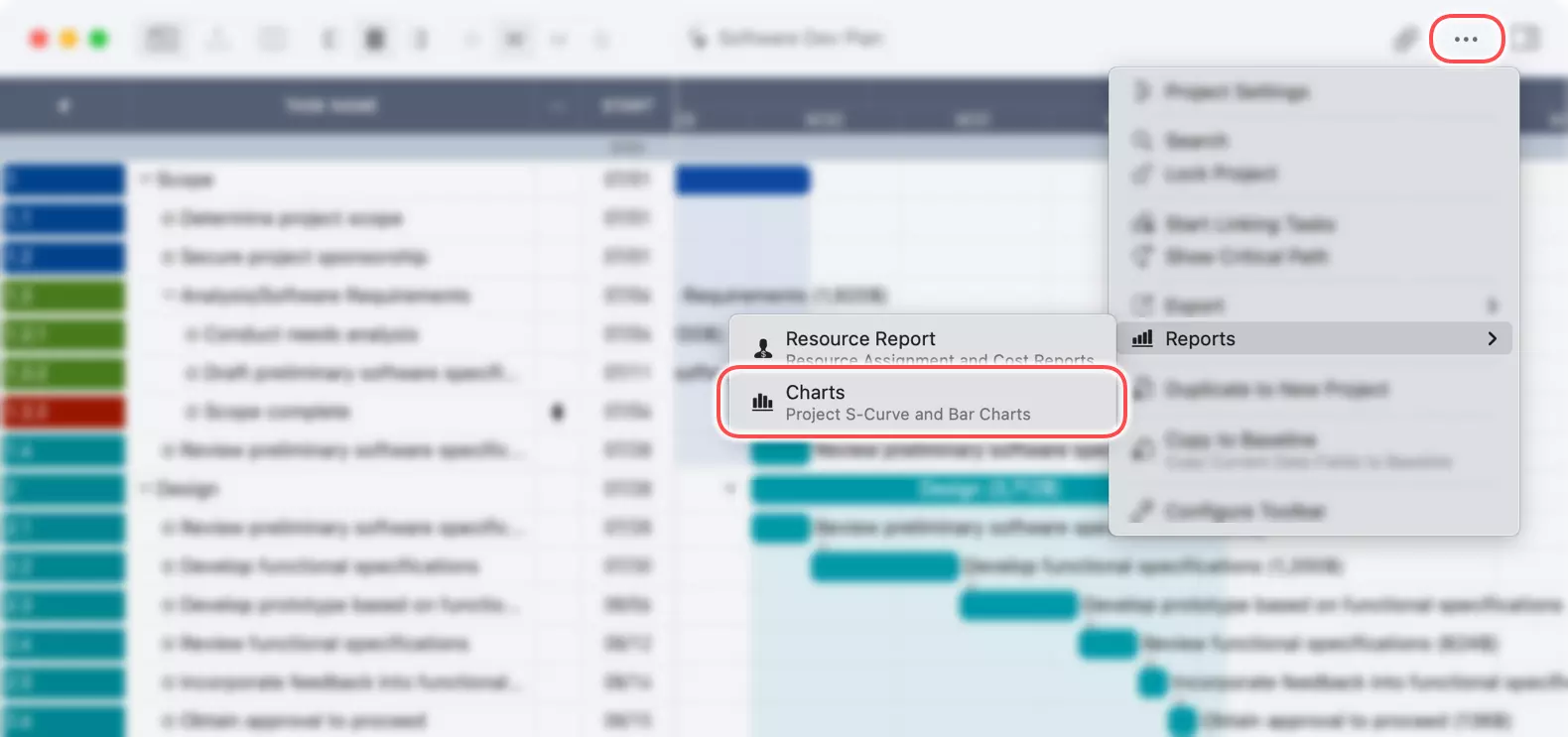
Accessing the Charts
You can access the project charts from the main project view.
- Tap on the "..." button in the toolbar.
- Select "Reports" from the menu.
- Tap on "Charts".
Understanding the Charts View
The charts view displays the S-Curve and Bar charts, along with a set of options to customize the data representation.
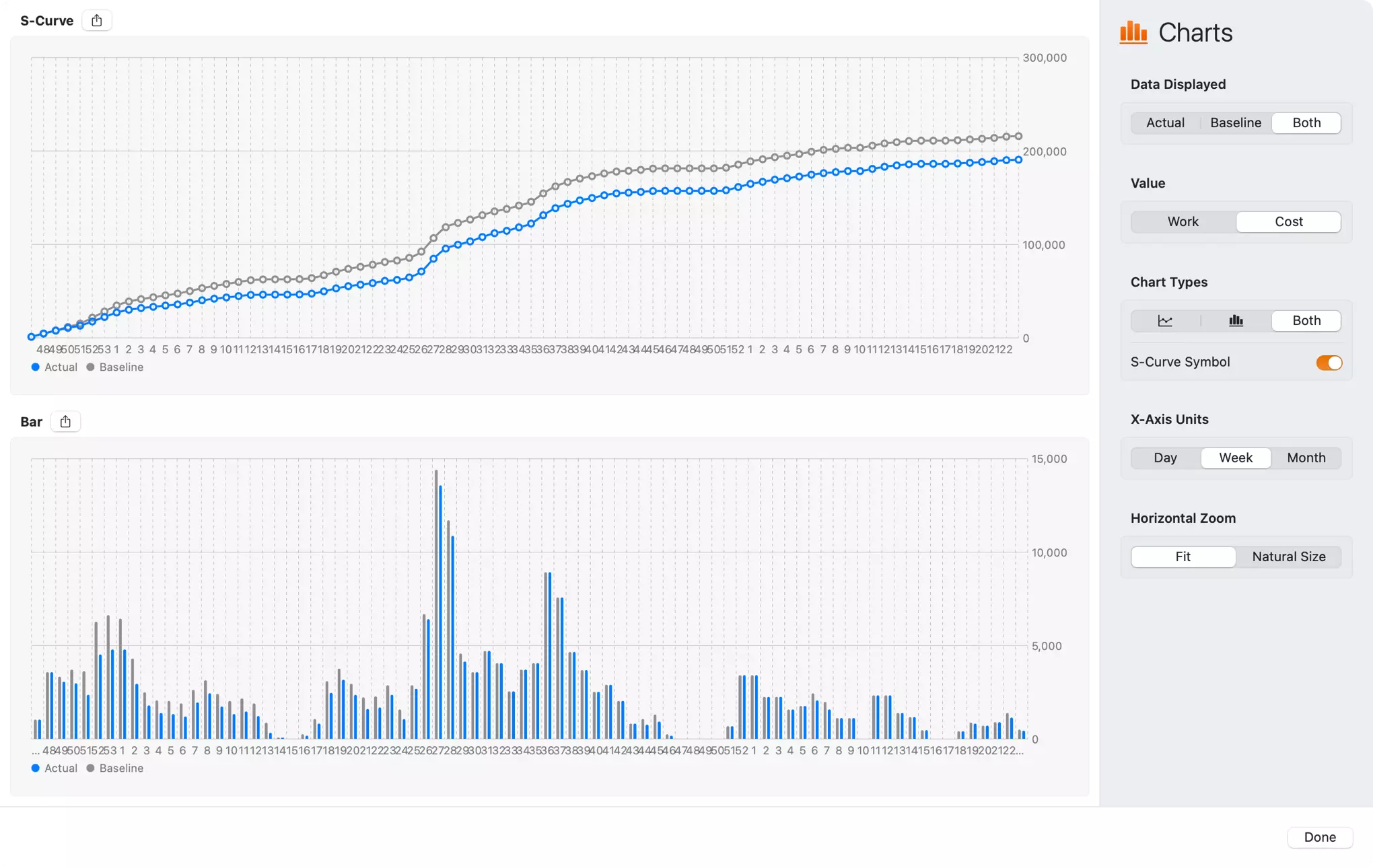
S-Curve Chart
The S-Curve chart illustrates the cumulative progress of your project over time. It's ideal for getting a high-level overview of whether the project is on track, ahead of schedule, or falling behind.
- The horizontal axis represents the project timeline.
- The vertical axis shows the cumulative value of 'Work' or 'Cost'.
You can compare the 'Actual' progress against the 'Baseline' plan, providing immediate insight into project performance.
A share button in the top-left corner of the S-curve chart is for exporting the S-curve chart to an image file.
Bar Chart
The Bar Chart provides a more granular view of the project's performance. It displays the 'Work' or 'Cost' for each specific time period (day, week, or month). This chart is useful for identifying specific periods of high or low activity and for analyzing resource allocation and expenditure in detail.
A share button in the top-left corner of the Bar chart is for exporting the Bar chart to an image file.
Customizing the Chart View
The inspector panel on the right side of the charts view provides several options to tailor the charts to your specific needs.
-
Data Displayed: Choose which data to visualize.
Actual: Shows the actual progress data.Baseline: Shows the planned baseline data.Both: Displays both actual and baseline data for direct comparison. (If there is no baseline data, theBaselineandBothoptions are disabled.)
-
Value: Select the metric to display on the charts.
Work: Visualizes the effort or work hours.Cost: Visualizes the project costs.
-
Chart Types: You can select to show the S-Curve, the Bar chart, or both.
-
S-Curve Symbol: A toggle to show or hide the symbols on the S-Curve line chart, which can help to check the data of each time point.
-
X-Axis Units: Adjust the time scale of the horizontal axis.
Day,Week,Month.
-
Horizontal Zoom: Control the zoom level of the chart's timeline.
Fit: Fits the entire project timeline into the view.Natural Size: Displays the chart in a default, unscaled size, which may require horizontal scrolling for longer projects.